The Brief
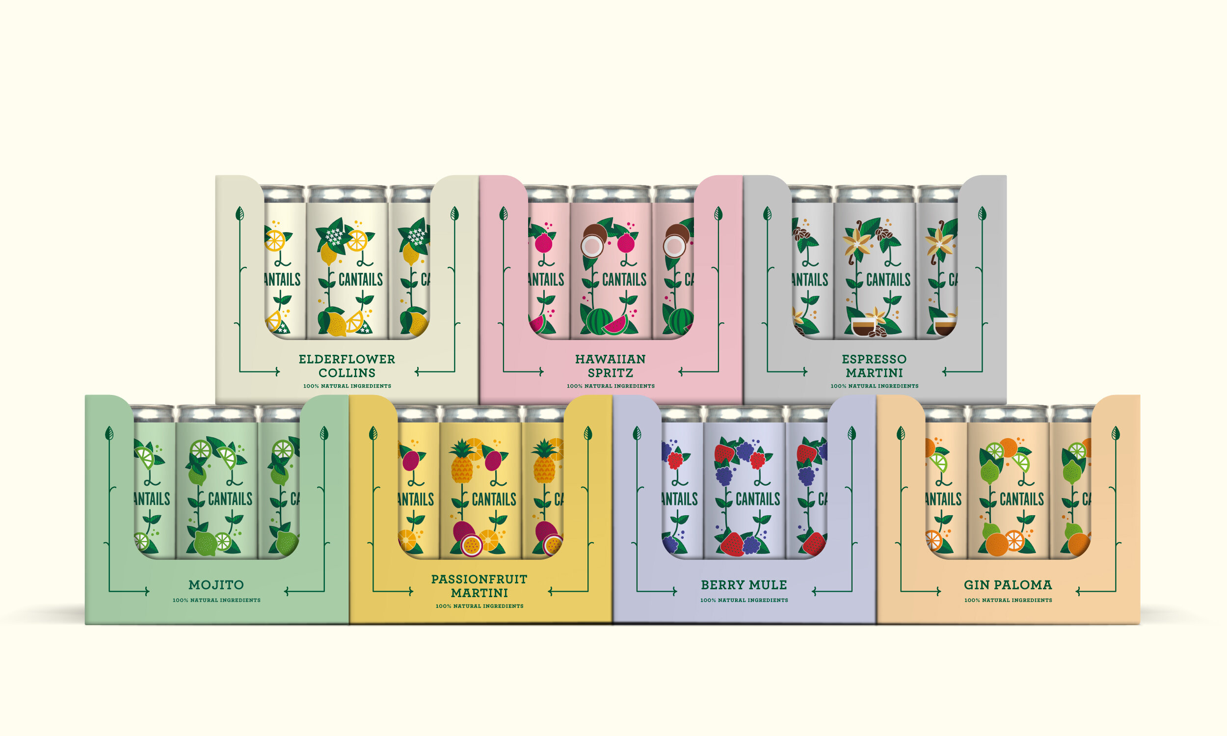
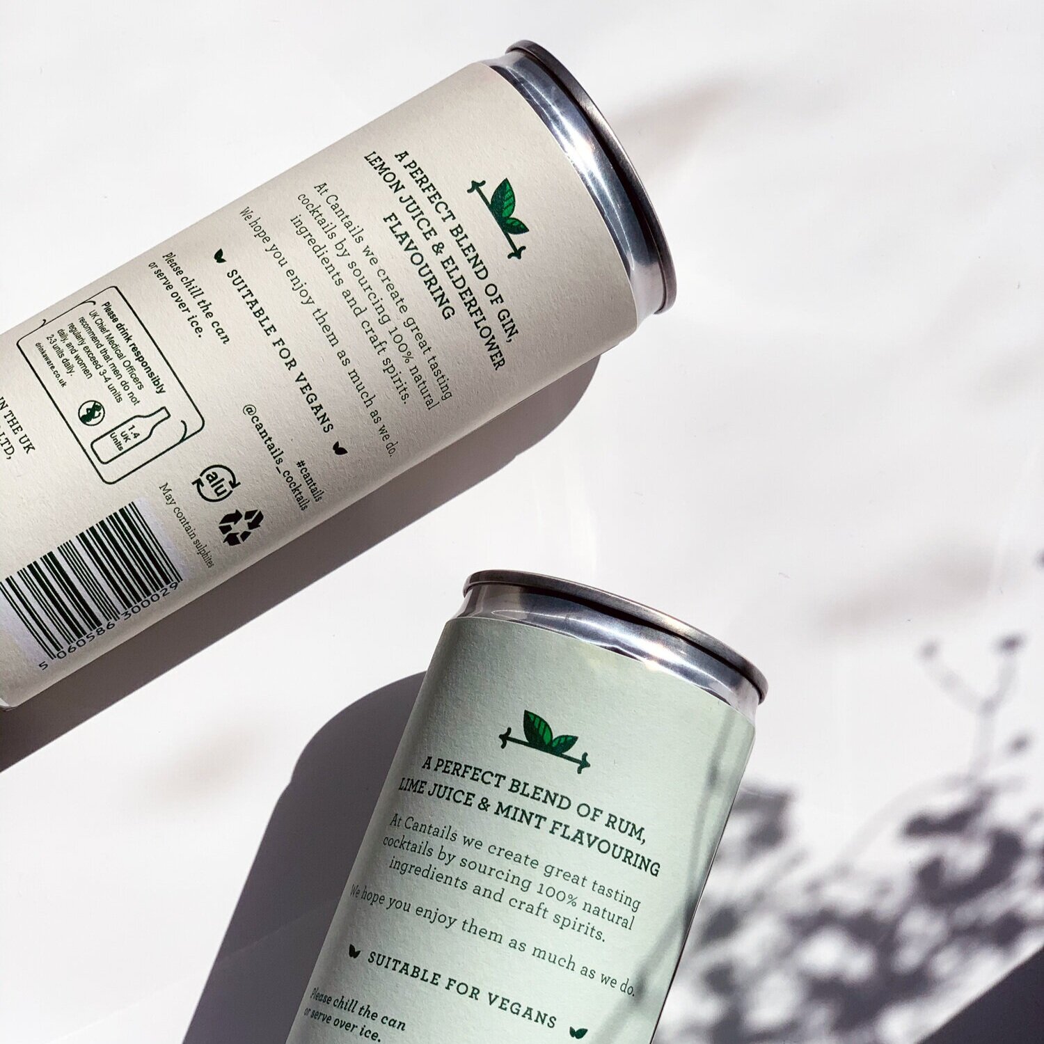
Cantails was created by brothers Myles and Kit Donneky, who wanted to deliver mixologist-approved cocktails-in-a-can into the retail market. They wanted their packaging to not just be eye-catching, but to also show off their offering of natural ingredients.

The Solution
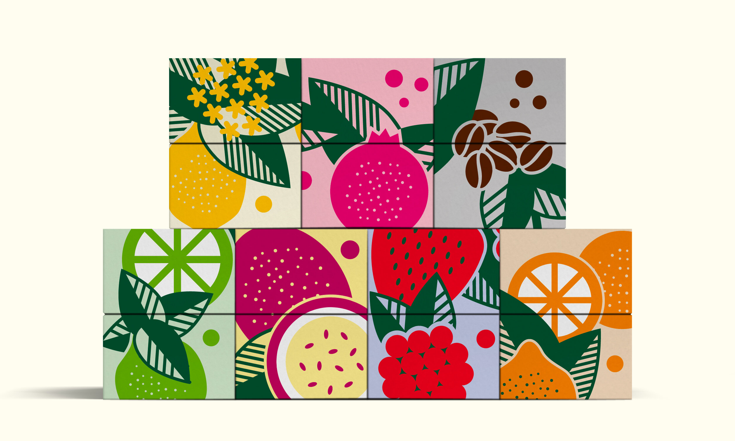
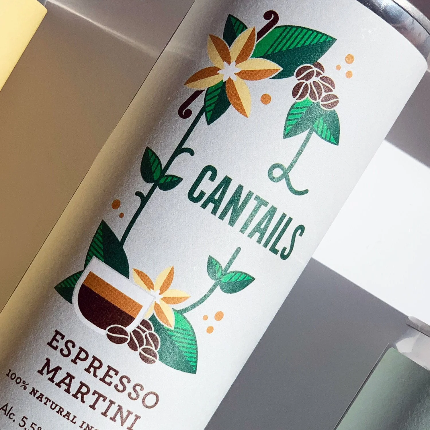
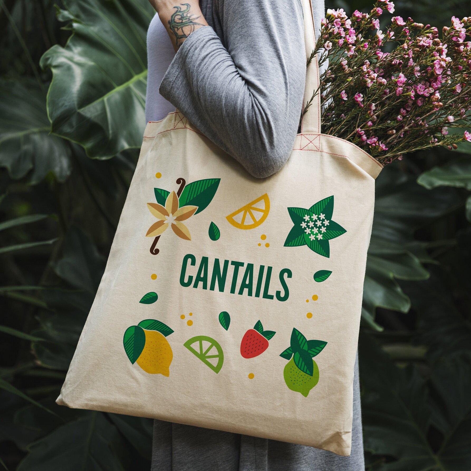
An illustrative route which brings to life the products’ quality ingredients and bold flavours.
Introducing a ‘Big C’ identity system and combining it with illustrations and pastel colours that scream flavour. The redesign resulted in the brand being approved by a major supermarket and a huge boost in social media engagement.
Visual identity. Packaging design. Illustration. Artwork. Website design.


“Mina has been instrumental in taking our business to the next level. She lead our full rebrand on Cantails and brought to life everything we envisioned and more! We couldn’t recommend her more highly and love working with her.”